I recently came across Reproducible Finance with R an RStudio Webinar conducted by Jonathan Regenstein.
Regenstein is the author of a book of the same title and the webinar is a walkthrough of some common tasks in portfolio analysis.
In the webinar, each task is done in three different ways to illustrate three common paradigms used by R practitioners. I decided to reproduce the tasks using one approach in particular: what Regenstein refers to as the xts approach (based on a key R package, xts).
R packages used
The code in this notebook utilizes functions in 9 packages.
- xts ecosystem packages
- PerformanceAnalytics: Econometric tools for performance and risk analysis
- quantmod: Quantitative Financial Modelling Framework
- xts: Extensible time series class and methods, extending and behaving like zoo.
- zoo: infrastructure for regular and irregular time series. (This a requirement for all of the other packages listed above.)
- packages used for data visualization
- ggplot2: data viz package for R
- highcharter: an htmlwidget interface to the Highcharts JavaScript charting library
- other packages
- purrr: for map and reduce functions
- tidyr: for gather function to reshape data
- dplyr: for filter function to subset data
All of these packages can be loaded by running the following code:
library(PerformanceAnalytics)
library(quantmod)
library(xts)
library(ggplot2)
library(highcharter)
library(purrr)
library(tidyr)
library(dplyr)
Choosing a portfolio
In the webinar, a portfolio of ETFs was used. I used a portfolio of 9 names which I more or less chose off the top of my head (with the exception of SPY which was one of the tickers used in the webinar portfolio.)
- AAPL: Apple Inc.
- DIS: Walt Disney Co
- GE: General Electric Company
- JNJ: Johnson & Johnson
- KO: Coca-Cola Co
- MSFT: Microsoft Corporation
- SBUX: Starbucks Corporation
- SPY: SPDR S&P 500 ETF Trust
- TGT: Target Corporation
Getting the data (from Yahoo Finance)
To get the historical data for my portfolio, I copied the webinar code verbatim, altering only the list of symbols to correspond to my own portfolio:
symbols <- c("AAPL", "DIS", "GE", "JNJ", "KO", "MSFT", "SBUX", "SPY", "TGT")
pr_daily <- getSymbols(symbols, src = "yahoo",
           from = "2007-12-31",
           to = "2020-02-29",
           auto.assign = TRUE) %>%
  map(~Ad(get(.))) %>%
  reduce(merge)
To see what the created object looks like we can look at the first few rows:
head(pr_daily)## AAPL.Adjusted DIS.Adjusted GE.Adjusted JNJ.Adjusted KO.Adjusted
## 2007-12-31 24.56307 27.38579 23.19337 46.11504 18.29796
## 2008-01-02 24.16129 27.01251 22.99941 45.56885 18.21448
## 2008-01-03 24.17245 26.95312 23.02445 45.58267 18.40530
## 2008-01-04 22.32725 26.41015 22.54894 45.52044 18.44108
## 2008-01-07 22.02839 26.43560 22.63652 46.22566 18.87640
## 2008-01-08 21.23599 25.90961 22.14851 46.28097 18.95391
## MSFT.Adjusted SBUX.Adjusted SPY.Adjusted TGT.Adjusted
## 2007-12-31 26.80937 8.690571 113.5825 36.39359
## 2008-01-02 26.52319 8.198091 112.5881 36.03694
## 2008-01-03 26.63617 7.939115 112.5337 36.08060
## 2008-01-04 25.89062 7.688627 109.7759 34.99608
## 2008-01-07 26.06383 7.803257 109.6827 35.65845
## 2008-01-08 25.19025 8.431596 107.9115 35.62934Breaking down the code above
The chain of calls above was not trivial, especially as I had not used any of the quantmod functions before. So I’ll break it up into steps to make sure I(we) understand what each step is doing.
The code makes the following calls – taking the output from each as the input to the following:
getSymbols: to get price data from Yahoo Finance
map: to apply the function Ad on multiple items
reduce: to combine results
So it is equivalent to the following:
symbols <- getSymbols(symbols, src = "yahoo",
           from = "2007-12-31",
           to = "2020-02-29",
           auto.assign = TRUE)
int_data <- map(symbols, ~Ad(get(.)))
final_data <- reduce(int_data, merge)
I’ll run each line of code on its own. First the call to getSymbols:
symbols <- getSymbols(symbols, src = "yahoo",
           from = "2007-12-31",
           to = "2020-02-29",
           auto.assign = TRUE)
Upon running, this function I can confirm that getSymbols is primarily run for its side-effects: the vector symbols contains simply the tickers in the portfolio but the environment now has data objects corresponding to each name in the portfolio.
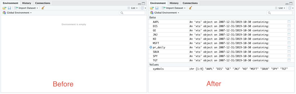
Environment compared before and after the call to the getSymbols function
Picking the first of these newly-created objects (in alphabetical order) we can see what they look like:
head(AAPL)## AAPL.Open AAPL.High AAPL.Low AAPL.Close AAPL.Volume AAPL.Adjusted
## 2007-12-31 28.50000 28.64286 28.25000 28.29714 134833300 24.56307
## 2008-01-02 28.46714 28.60857 27.50714 27.83429 269794700 24.16129
## 2008-01-03 27.91571 28.19857 27.52714 27.84714 210516600 24.17245
## 2008-01-04 27.35000 27.57143 25.55571 25.72143 363958000 22.32725
## 2008-01-07 25.89286 26.22857 24.31857 25.37714 518048300 22.02839
## 2008-01-08 25.73428 26.06571 24.40000 24.46429 380954000 21.23599Each row contains a summary of the prices recorded during the corresponding day.
Next to run the call to map{purrr}. The intermediate data object created, int_data is a list of 9 xts objects.
So we can see that this call isolates the Adjusted column for each name from the larger object that contains more fields.
int_data <- map(symbols, ~Ad(get(.)))
head(int_data[[1]])
## AAPL.Adjusted
## 2007-12-31 24.56307
## 2008-01-02 24.16129
## 2008-01-03 24.17245
## 2008-01-04 22.32725
## 2008-01-07 22.02839
## 2008-01-08 21.23599Finally, we run the call to reduce{purrr}, which binds all the objects created into a single xts object. For confirmation, the final object should be the same as the pr_daily object we created previously.
final_data <- reduce(int_data, merge)
head(final_data)
## AAPL.Adjusted DIS.Adjusted GE.Adjusted JNJ.Adjusted KO.Adjusted
## 2007-12-31 24.56307 27.38579 23.19337 46.11504 18.29796
## 2008-01-02 24.16129 27.01251 22.99941 45.56885 18.21448
## 2008-01-03 24.17245 26.95312 23.02445 45.58267 18.40530
## 2008-01-04 22.32725 26.41015 22.54894 45.52044 18.44108
## 2008-01-07 22.02839 26.43560 22.63652 46.22566 18.87640
## 2008-01-08 21.23599 25.90961 22.14851 46.28097 18.95391
## MSFT.Adjusted SBUX.Adjusted SPY.Adjusted TGT.Adjusted
## 2007-12-31 26.80937 8.690571 113.5825 36.39359
## 2008-01-02 26.52319 8.198091 112.5881 36.03694
## 2008-01-03 26.63617 7.939115 112.5337 36.08060
## 2008-01-04 25.89062 7.688627 109.7759 34.99608
## 2008-01-07 26.06383 7.803257 109.6827 35.65845
## 2008-01-08 25.19025 8.431596 107.9115 35.62934Next we rename the fields so they can be a little neater.
names(pr_daily) <- symbols
head(pr_daily)
## AAPL DIS GE JNJ KO MSFT SBUX
## 2007-12-31 24.56307 27.38579 23.19337 46.11504 18.29796 26.80937 8.690571
## 2008-01-02 24.16129 27.01251 22.99941 45.56885 18.21448 26.52319 8.198091
## 2008-01-03 24.17245 26.95312 23.02445 45.58267 18.40530 26.63617 7.939115
## 2008-01-04 22.32725 26.41015 22.54894 45.52044 18.44108 25.89062 7.688627
## 2008-01-07 22.02839 26.43560 22.63652 46.22566 18.87640 26.06383 7.803257
## 2008-01-08 21.23599 25.90961 22.14851 46.28097 18.95391 25.19025 8.431596
## SPY TGT
## 2007-12-31 113.5825 36.39359
## 2008-01-02 112.5881 36.03694
## 2008-01-03 112.5337 36.08060
## 2008-01-04 109.7759 34.99608
## 2008-01-07 109.6827 35.65845
## 2008-01-08 107.9115 35.62934Getting monthly returns
Computing monthly returns consists of two steps:
- filtering the data down to the last day of each month
- calculating the month-on-month returns
Filtering the data
The first step in getting monthly returns is to filter the data down to the last entries of each month. To do this to.monthly {xts} is used:
pr_monthly <- to.monthly(pr_daily, indexAt = "lastof", OHLC = FALSE)
head(pr_monthly)
## AAPL DIS GE JNJ KO MSFT SBUX
## 2007-12-31 24.56307 27.38579 23.19337 46.11504 18.29796 26.80937 8.690571
## 2008-01-31 16.78543 25.31574 22.12349 43.65372 17.59133 24.55014 8.028270
## 2008-02-29 15.50321 27.49608 20.93090 43.12204 17.43032 20.56315 7.633437
## 2008-03-31 17.79484 26.62225 23.37516 45.14731 18.38383 21.45523 7.429655
## 2008-04-30 21.57081 27.51305 20.65300 46.69235 17.77979 21.56107 6.890471
## 2008-05-31 23.40610 28.50566 19.40246 46.77612 17.29354 21.48868 7.722594
## SPY TGT
## 2007-12-31 113.5825 36.39359
## 2008-01-31 106.7151 40.33866
## 2008-02-29 103.9573 38.39448
## 2008-03-31 103.0277 36.98598
## 2008-04-30 107.9383 38.77398
## 2008-05-31 109.5699 39.04104Calculating returns
Return.calculate {PerformanceAnalytics} is then used to calculate the log returns. (The call to na.omit has the effect of removing the first row of the data which has no entry for monthly returns)
rt_monthly <- na.omit(Return.calculate(pr_monthly, method = "log"))
head(rt_monthly)
## AAPL DIS GE JNJ KO
## 2008-01-31 -0.38073331 -0.07859813 -0.04722692 -0.054850532 -0.039383857
## 2008-02-29 -0.07946392 0.08261746 -0.05541318 -0.012254197 -0.009194779
## 2008-03-31 0.13786138 -0.03229641 0.11044751 0.045896327 0.053260041
## 2008-04-30 0.19243278 0.03291340 -0.12381350 0.033649642 -0.033409064
## 2008-05-31 0.08165552 0.03544198 -0.06246093 0.001792498 -0.027728943
## 2008-06-30 -0.11979834 -0.07410785 -0.12913069 -0.036623041 -0.083556014
## MSFT SBUX SPY TGT
## 2008-01-31 -0.08803374 -0.07926958 -0.062366178 0.102917717
## 2008-02-29 -0.17721680 -0.05043086 -0.026182251 -0.049396489
## 2008-03-31 0.04246774 -0.02705878 -0.008982603 -0.037374911
## 2008-04-30 0.00492061 -0.07533998 0.046561369 0.047210433
## 2008-05-31 -0.00336281 0.11401088 0.015002940 0.006864178
## 2008-06-30 -0.02901842 -0.14466668 -0.087275530 -0.137824431Adding portfolio weights
I made a choice to give each name in the portfolio equal weight whenever the portfolio is being rebalanced. So first, we create a vector of weights and then use Return.portfolio {PerformanceAnalytics} to get the monthly returns for the rebalanced portfolio.
pw <- rep(1/9, 9)

rt_rebal_mo <- Return.portfolio(rt_monthly, weights = pw,
                                    rebalance_on = "months")
This creates an xts object of portfolio returns for a portfolio rebalanced monthly:
head(rt_rebal_mo)## portfolio.returns
## 2008-01-31 -0.08083828
## 2008-02-29 -0.04188167
## 2008-03-31 0.03158003
## 2008-04-30 0.01390285
## 2008-05-31 0.01791281
## 2008-06-30 -0.09355567The date is a row index. And not contained in a column of the data.
Just taking a pause to note that the date is the row index, an essential ingredient of an xts object. (This was pointed out in the webinar.)
head(index(rt_rebal_mo))## [1] "2008-01-31" "2008-02-29" "2008-03-31" "2008-04-30" "2008-05-31"
## [6] "2008-06-30"Ok, now for some useful calculations
Next we use some of the functions provided by the PerformanceAnalytics package to calculate common summary statistics for the portfolio.
Standard Deviation of returns
We can get the standard deviation of the returns using StdDev {PerformanceAnalytics}.
sd_rt <- StdDev(rt_rebal_mo)
sd_rt
## [,1]
## StdDev 0.04631466I notice that this appears to be a matrix object. So I checked:
class(sd_rt)## [1] "matrix"Table of Downside Risks
Another useful function is table.DownsideRisk {PerformanceAnalytics}, which compiles 11 different risk metrics.
table.DownsideRisk(rt_rebal_mo)## portfolio.returns
## Semi Deviation 0.0350
## Gain Deviation 0.0269
## Loss Deviation 0.0357
## Downside Deviation (MAR=10%) 0.0349
## Downside Deviation (Rf=0%) 0.0311
## Downside Deviation (0%) 0.0311
## Maximum Drawdown 0.5219
## Historical VaR (95%) -0.0793
## Historical ES (95%) -0.1046
## Modified VaR (95%) -0.0734
## Modified ES (95%) -0.1107Table of Drawdowns
We can also get a summary of the worst drawdowns in the time period we have data for, using table.Drawdowns {PerformanceAnalytics}:
table.Drawdowns(rt_rebal_mo)## From Trough To Depth Length To Trough Recovery
## 1 2008-01-31 2009-02-28 2011-02-28 -0.5219 38 14 24
## 2 2018-10-31 2018-12-31 2019-04-30 -0.1329 7 3 4
## 3 2020-02-29 2020-02-29 <NA> -0.0968 2 1 NA
## 4 2011-08-31 2011-09-30 2011-12-31 -0.0822 5 2 3
## 5 2014-01-31 2014-01-31 2014-04-30 -0.0699 4 1 3SemiDeviation
One of the measures included in the table of Downside risks above was the SemiDeviation, the standard deviation of returns below the mean. This summary statistic can be returned as a standalone value using the SemiDeviation {PerformanceAnalytics} function.
SemiDeviation(rt_rebal_mo)## portfolio.returns
## Semi-Deviation 0.035027Returns summary
A general summary of returns can be obtained using table.Stats {PerformanceAnalytics}
table.Stats(rt_rebal_mo)## portfolio.returns
## Observations 146.0000
## NAs 0.0000
## Minimum -0.1645
## Quartile 1 -0.0117
## Median 0.0136
## Arithmetic Mean 0.0086
## Geometric Mean 0.0075
## Quartile 3 0.0343
## Maximum 0.1338
## SE Mean 0.0038
## LCL Mean (0.95) 0.0010
## UCL Mean (0.95) 0.0161
## Variance 0.0021
## Stdev 0.0463
## Skewness -0.5775
## Kurtosis 1.3781Visualizing portfolio performance
Next, the webinar moved into visualizing the performance of the portfolio. This was done using both ggplot2 and highcharter. I reproduced both and inserted an extra ggplot2 chart of my own.
Combining all returns into one object
The first step we take on the way to visualizing the portfolio’s returns is to create a single xts object with the monthly returns of the portfolio (rebalanced monthly) in addition to the returns corresponding to each of the individual tickers. This makes use ofmerge.xts {xts}.
rt_rebal_mo <- merge.xts(rt_rebal_mo, rt_monthly)
df <- data.frame(rt_rebal_mo, date = index(rt_rebal_mo))
head(df)
## portfolio.returns AAPL DIS GE JNJ
## 2008-01-31 -0.08083828 -0.38073331 -0.07859813 -0.04722692 -0.054850532
## 2008-02-29 -0.04188167 -0.07946392 0.08261746 -0.05541318 -0.012254197
## 2008-03-31 0.03158003 0.13786138 -0.03229641 0.11044751 0.045896327
## 2008-04-30 0.01390285 0.19243278 0.03291340 -0.12381350 0.033649642
## 2008-05-31 0.01791281 0.08165552 0.03544198 -0.06246093 0.001792498
## 2008-06-30 -0.09355567 -0.11979834 -0.07410785 -0.12913069 -0.036623041
## KO MSFT SBUX SPY TGT
## 2008-01-31 -0.039383857 -0.08803374 -0.07926958 -0.062366178 0.102917717
## 2008-02-29 -0.009194779 -0.17721680 -0.05043086 -0.026182251 -0.049396489
## 2008-03-31 0.053260041 0.04246774 -0.02705878 -0.008982603 -0.037374911
## 2008-04-30 -0.033409064 0.00492061 -0.07533998 0.046561369 0.047210433
## 2008-05-31 -0.027728943 -0.00336281 0.11401088 0.015002940 0.006864178
## 2008-06-30 -0.083556014 -0.02901842 -0.14466668 -0.087275530 -0.137824431
## date
## 2008-01-31 2008-01-31
## 2008-02-29 2008-02-29
## 2008-03-31 2008-03-31
## 2008-04-30 2008-04-30
## 2008-05-31 2008-05-31
## 2008-06-30 2008-06-30Plotting portfolio returns
ggplot {ggplot2} can be used to make a line chart of the entire portfolio’s returns over the time period of analysis.
ggplot(data = df, aes(x = date, y = portfolio.returns)) +
  geom_line(colour = "brown") +
  scale_x_date(breaks = scales::pretty_breaks(n = 6)) +
  ggtitle("Returns by Date") +
theme(plot.title = element_text(hjust = 0.5)) 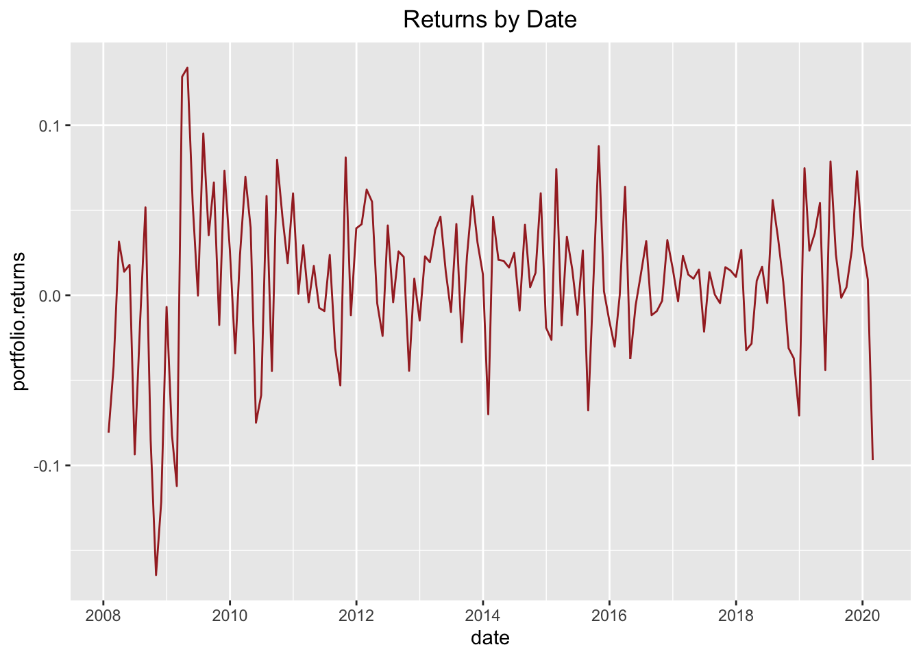
Visualizing each component compared to the portfolio
Next, I decided to try to plot the returns of each portfolio component in contrast to the aggregate returns. To do this I first reshaped the data using gather {tidyr} to get it into a good format for using ggplot {ggplot2} later on. (After the reshaping, I output one line per ticker to illustrate the format of the new data frame.)
df_narrow <- gather(df, key = "Component", value = "Return", -date)
df_narrow[c(1, 143, 285, 427, 569, 711, 853, 995, 1137, 1279),]
## date Component Return
## 1 2008-01-31 portfolio.returns -0.080838281
## 143 2019-11-30 portfolio.returns 0.072999880
## 285 2019-07-31 AAPL 0.073617139
## 427 2019-03-31 DIS -0.016170454
## 569 2018-11-30 GE -0.297632688
## 711 2018-07-31 JNJ 0.088137147
## 853 2018-03-31 KO 0.013635783
## 995 2017-11-30 MSFT 0.016841127
## 1137 2017-07-31 SBUX -0.077160146
## 1279 2017-03-31 SPY 0.001249255Now that the data has been reshaped, I can plot the returns by portfolio component with the aggregate returns as contrast for each component.
bg_df <- filter(df_narrow, Component == "portfolio.returns") %>%
  select(-Component)
ggplot(data = filter(df_narrow, Component != "portfolio.returns")) +
  geom_line(data = bg_df, aes(x = date, y = Return), colour = "#484848") +
  geom_line(alpha = 0.6, aes(x = date, y = Return, group = Component, colour = Component)) +
  facet_wrap(~Component) + theme_bw() +
theme(legend.position = "none") 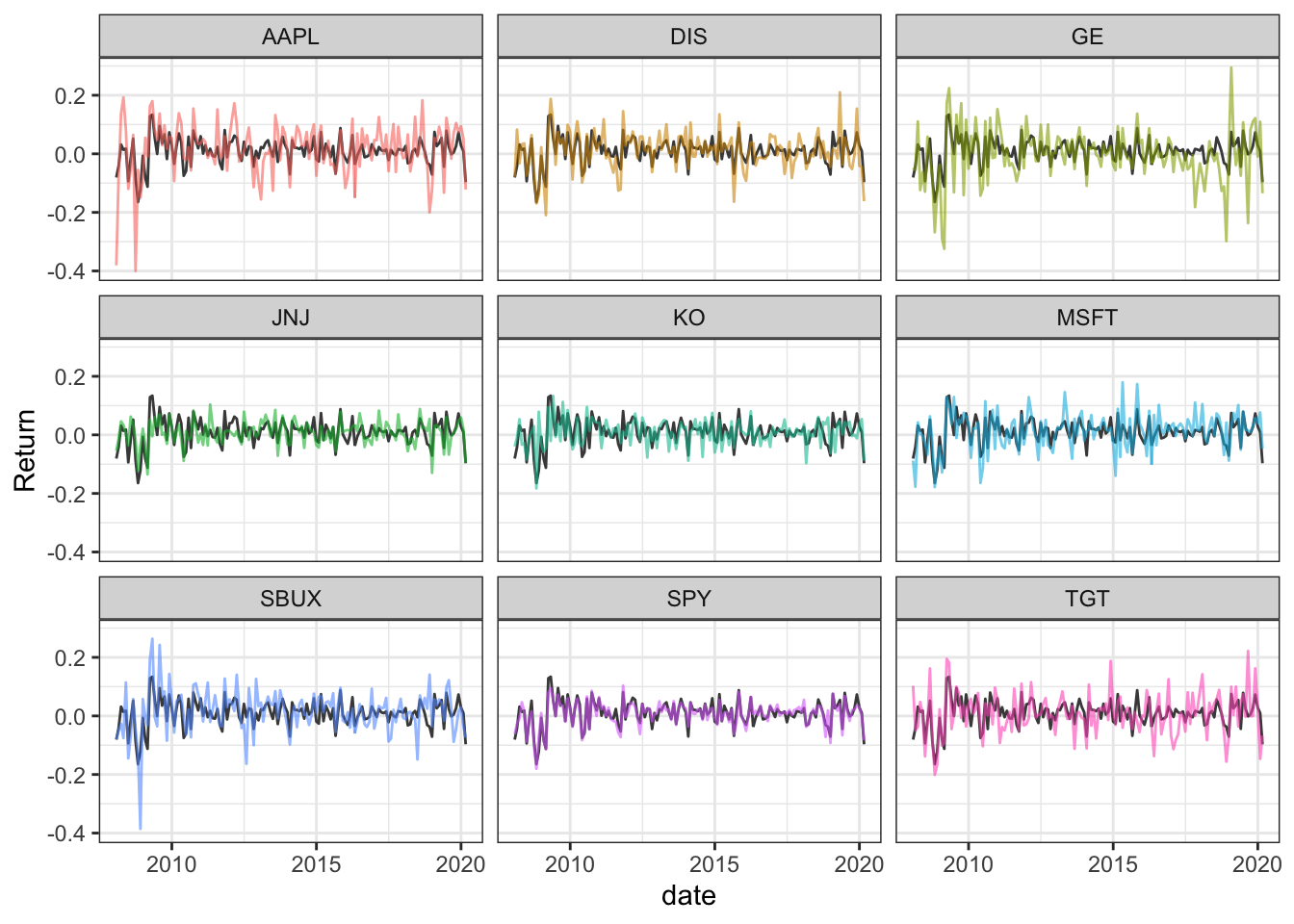
I guess it makes sense that SPY would the name that matches the overall portfolio volatility most closely.
Using highcharter
I was unacquainted with the highcharter package (and the Highcharts JavaScript library that it interfaces with) and I was impressed by the interactive chart/application created by a single function call. I simply copied the webinar code verbatim and ran it. And it worked.
Computing rolling standard deviations.
As a preliminary to creating the application, we use the rollapply {zoo} function to calculate the rolling 24-month standard deviation of returns of the portfolio:
window <- 24

pr_rolling_sd_24 <- rollapply(rt_rebal_mo, FUN = sd,
          width = window) %>%
  na.omit()

head(pr_rolling_sd_24)
## portfolio.returns AAPL DIS GE JNJ
## 2009-12-31 0.08020547 0.1521762 0.09532935 0.1478034 0.05427652
## 2010-01-31 0.07881214 0.1304394 0.09566684 0.1489913 0.05325714
## 2010-02-28 0.07850899 0.1292145 0.09481646 0.1490276 0.05318425
## 2010-03-31 0.07953502 0.1292370 0.09720802 0.1496388 0.05283252
## 2010-04-30 0.07987655 0.1253638 0.09755685 0.1486094 0.05251644
## 2010-05-31 0.08137734 0.1247573 0.09958678 0.1505325 0.05561335
## KO MSFT SBUX SPY TGT
## 2009-12-31 0.06890428 0.08623899 0.1377571 0.06960647 0.1042185
## 2010-01-31 0.06919820 0.08585820 0.1372321 0.06895668 0.1026855
## 2010-02-28 0.06944480 0.07765560 0.1369720 0.06929297 0.1022012
## 2010-03-31 0.06963189 0.07731960 0.1370646 0.07054538 0.1019549
## 2010-04-30 0.06953465 0.07772310 0.1362072 0.06987447 0.1027298
## 2010-05-31 0.06978010 0.08502772 0.1347768 0.07152520 0.1031023Next, I created the HighChart plot. Again using the code from the webinar (but I make one tiny exception to turn the legend off.)
highchart(type = "stock") %>%
  hc_title(text = "24-Month Rolling volatility") %>%
  hc_add_series(pr_rolling_sd_24) %>%
  hc_add_theme(hc_theme_flat()) %>%
  hc_yAxis(
    labels = list(format = "{value}%"),
    opposite = FALSE) %>%
  hc_navigator(enabled = FALSE) %>%
  hc_scrollbar(enabled = FALSE) %>%
  hc_exporting(enabled = TRUE) %>%
  hc_legend(enabled = FALSE)
I really like this chart and it makes me think that I need to learn more about the Highcharts JavaScript library.
Anyhow, that’s it: the entire walkthrough of the webinar tasks using the xts ecosystem. In the webinar, each of these tasks is also done in two alternative ways: using what he described as tidyverse and tidyquant approaches respectively. I decided to focus on the xts approach because it seemed like the cleanest for the problem at hand.