This post is about using the ggplot2 package to make simple maps using R. All the necessary input data are accessible at https://github.com/thisisdaryn/data/tree/master/geo/chicago.
I have found ggplot2 to be an accessible entry point to map-making in R: ggplot2 is my preferred data visualization solution generally and making maps with ggplot2 requires relatively little new knowledge to get up and running making simple maps.
This post does not cover principles of good cartography. The maps created were done primarily for the purpose of demonstrating the functionality of the packages used. I would advise that anyone publishing maps for public consumption put more thought into the technical choices made e.g. the choice of scales than this post demonstrates.
The sf package
The sf package is a key to making maps easily using ggplot2. The package name is derived from simple features, a standardised way to encode spatial vector data.
Using read_sf to read in a GeoJSON file
The code below uses sf::read_sf to read in vector data in GeoJSON format. This particular GeoJSON file was sourced from the Chicago Data Portal and contains the boundaries of 77 identified community areas in the City of Chicago, Illinois.
library(sf)

chi_map <- read_sf("https://raw.githubusercontent.com/thisisdaryn/data/master/geo/chicago/Comm_Areas.geojson")
A glance at the chi_map object shows that it looks like a typical dataframe, perhaps with a few exceptions: there’s a bounding box, bbox, some text, proj4string indicating the project used, and a geometry variable containing what appear to be longitude and latitude coordinates. (The screenshot below is the result of running the head function with chi_map as input on my own machine.)
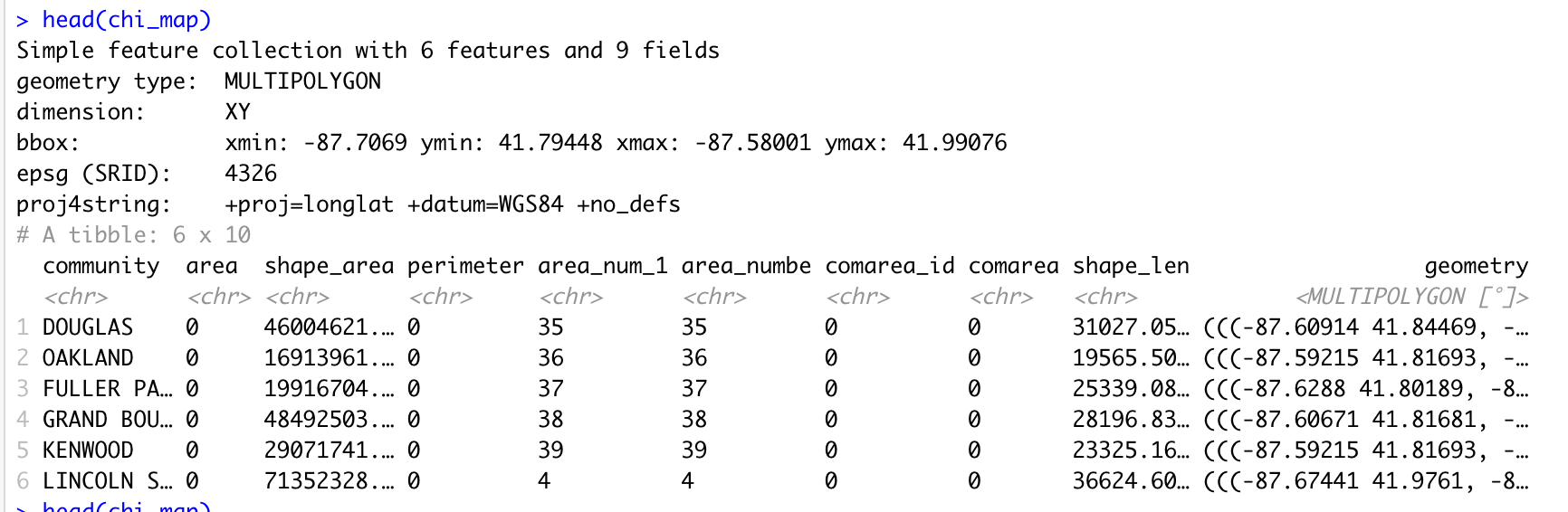
Screen shot showing the top of the sf object read in from a GeoJSON file
A note on using shapefiles
Alternatively, we could have read in the data from a shapefile containing the equivalent geospatial information. Shapefiles are an industry-standard, extremely common file format developed by ESRI and may plausibly be the format that the data you want to work with is most-readily distributed.
The github repository also contains a shapefile directory, Comm_Areas_shp with equivalent geospatial information that was also obtained from the Chicago Data Portal.
Using ggplot2 with geom_sf
The key to using ggplot2 to make maps with sf objects is that they are also dataframes and thus are basically ready to go to be used as data for ggplot2::ggplot.
First map with geom_sf
We can make a first map by using our map dataframe as the data input to ggplot2::ggplot and by using a special geometry, ggplot2::geom_sf:
library(ggplot2)

ggplot(data = chi_map) + geom_sf()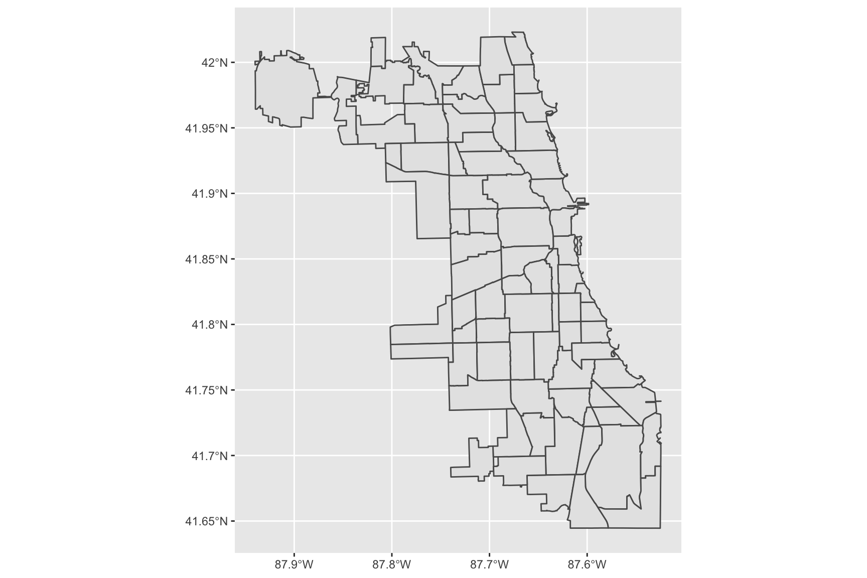
Adding labels with geom_sf_text
Another useful geometry that allows us to add information to maps pretty easily is ggplot2::geom_sf_text. In the code below, we use this geometry to add the number of identifying number of each Chicago community area to the simple map.
ggplot(data = chi_map) +
  geom_sf() +
  geom_sf_text(aes(label = area_num_1))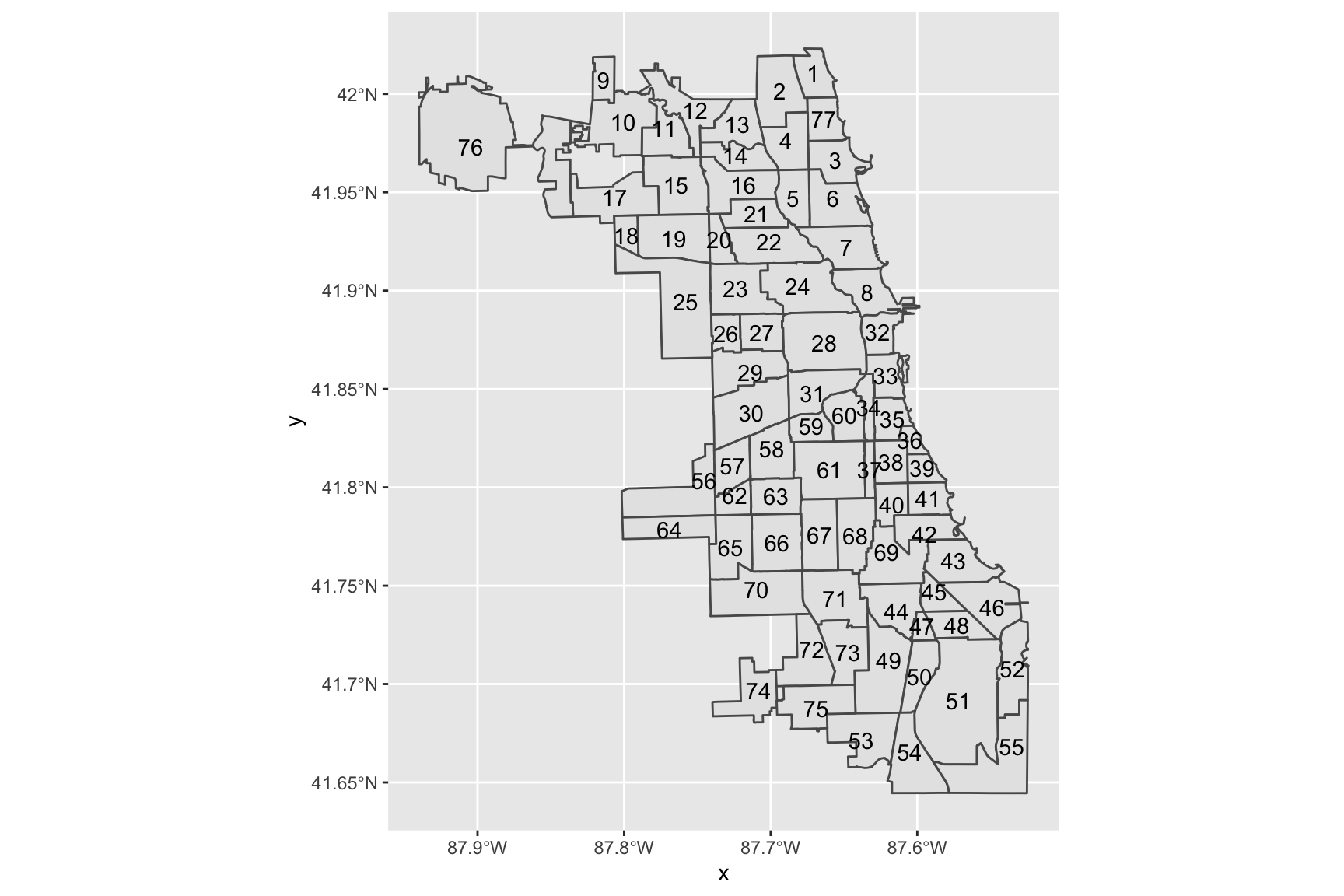
Changing the theme of a map
We can change the theme for a map just as with any other ggplot2 graph. For example, here is the previous map with an additional call to ggplot2::theme_bw to get a black and white theme.
ggplot(data = chi_map) +
  geom_sf() +
  geom_sf_text(aes(label = area_num_1)) +
  theme_bw()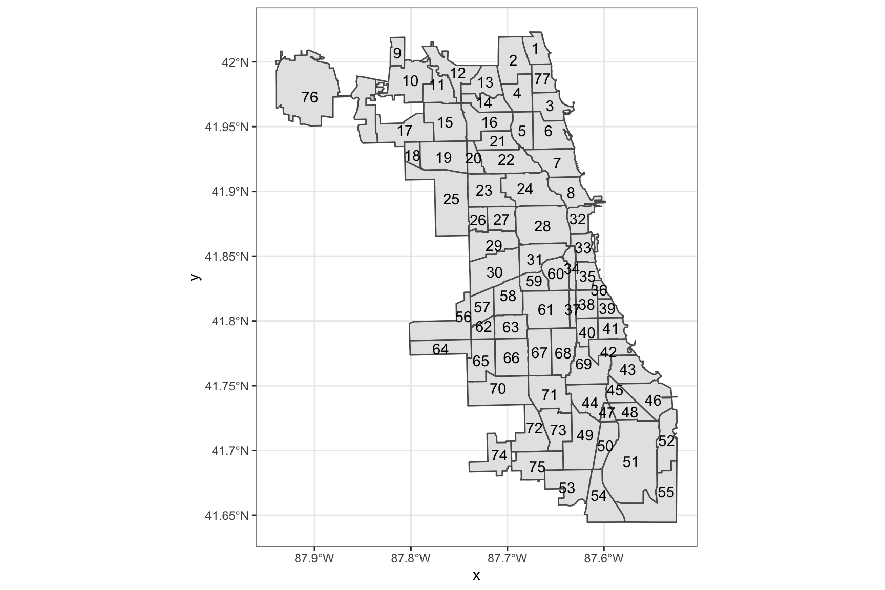
Getting some other data
To make chloropleth maps we need to get other information corresponding to the geographical areas demarcated in the map.
Chicago Open Data has a data set of Public Health Statistics for the community areas. This is a good source of data to use to make chloropleth maps in conjunction with the geospatial data.
library(readr)

chi_health <- read_csv("https://raw.githubusercontent.com/thisisdaryn/data/master/geo/chicago/Chicago_Health_Statistics.csv")


head(chi_health)
# A tibble: 6 x 29
`Community Area` `Community Area… `Birth Rate` `General Fertil…
<dbl> <chr> <dbl> <dbl>
1 1 Rogers Park 16.4 62
2 2 West Ridge 17.3 83.3
3 3 Uptown 13.1 50.5
4 4 Lincoln Square 17.1 61
5 5 North Center 22.4 76.2
6 6 Lake View 13.5 38.7
# … with 25 more variables: `Low Birth Weight` <dbl>, `Prenatal Care Beginning
# in First Trimester` <dbl>, `Preterm Births` <dbl>, `Teen Birth Rate` <dbl>,
# `Assault (Homicide)` <dbl>, `Breast cancer in females` <dbl>, `Cancer (All
# Sites)` <dbl>, `Colorectal Cancer` <dbl>, `Diabetes-related` <dbl>,
# `Firearm-related` <dbl>, `Infant Mortality Rate` <dbl>, `Lung
# Cancer` <dbl>, `Prostate Cancer in Males` <dbl>, `Stroke (Cerebrovascular
# Disease)` <dbl>, `Childhood Blood Lead Level Screening` <dbl>, `Childhood
# Lead Poisoning` <dbl>, `Gonorrhea in Females` <dbl>, `Gonorrhea in
# Males` <chr>, Tuberculosis <dbl>, `Below Poverty Level` <dbl>, `Crowded
# Housing` <dbl>, Dependency <dbl>, `No High School Diploma` <dbl>, `Per
# Capita Income` <dbl>, Unemployment <dbl>In this data frame, the Community Area IDs are numerical variables. In order to make joining the two data sets together, create a new column, area_num_1, as text/character data. (Using the same name, area_num_1 that is already in the chi_map data frame will make joining especially easy.)
library(dplyr)

chi_health <- chi_health %>%
  mutate(area_num_1 = as.character(`Community Area`))
Joining an sf object to another dataframe
Next, use dplyr::left_join to join chi_map to chi_health:
chi_health_map <- left_join(chi_map, chi_health, by = "area_num_1")This creates a single dataframe with the geographic boundaries as well as the values for the measured variables.
Making a chloropleth map
To make a chloropleth map using one of the statistics in the merged dataframe, we can use the fill aesthetic. Here, we use the Unemployment column of the merged data:
ggplot(data = chi_health_map, aes(fill = Unemployment)) +
  geom_sf() +
  ggtitle("Unemployment rates in Chicago Community Areas")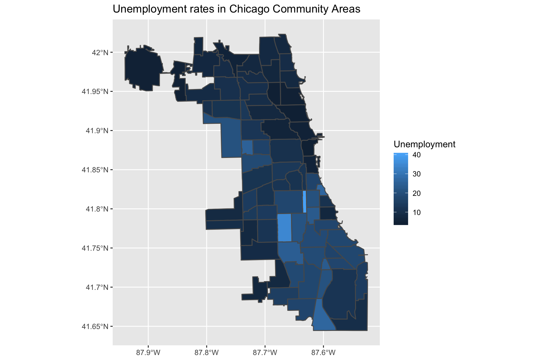
Changing the scale
The previous map uses the default continuous scale for the fill aesthetic. Note that we can make the same map as before by using scale_fill_continuous:
ggplot(data = chi_health_map, aes(fill = Unemployment)) +
  geom_sf() +
  scale_fill_continuous() +
  ggtitle("Unemployment rates in Chicago Community Areas")
Using the viridis scale
Alternatively, we could use the viridis scale which is also available in scale_fill_continuous:
ggplot(data = chi_health_map, aes(fill = Unemployment)) +
  geom_sf() +
  scale_fill_continuous(type = "viridis") +
  ggtitle("Unemployment rates in Chicago Community Areas")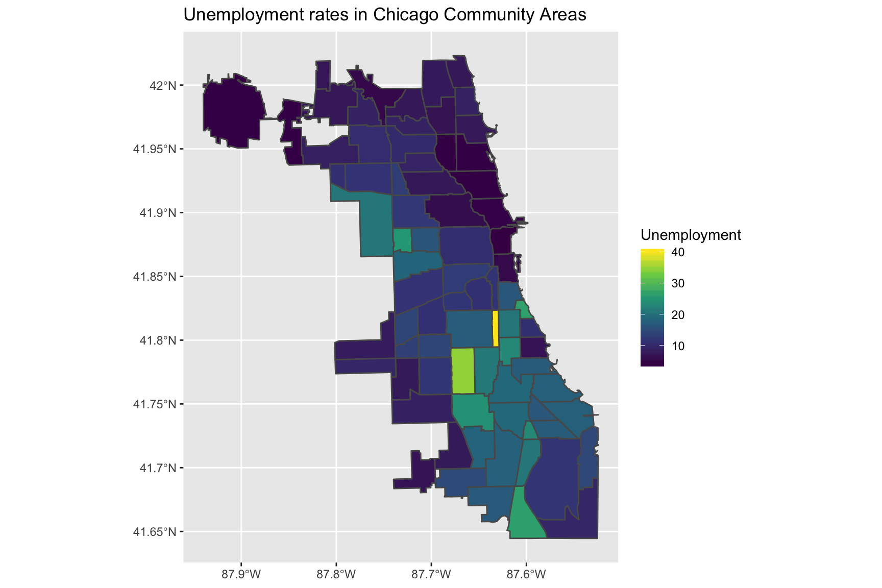
Manually setting a continuous scale
Another option is to manually set low and high arguments to scale_fill_continuous
ggplot(data = chi_health_map, aes(fill = Unemployment)) +
  geom_sf() +
  scale_fill_continuous(low = "ivory", high = "brown") +
  ggtitle("Unemployment rates in Chicago Community Areas")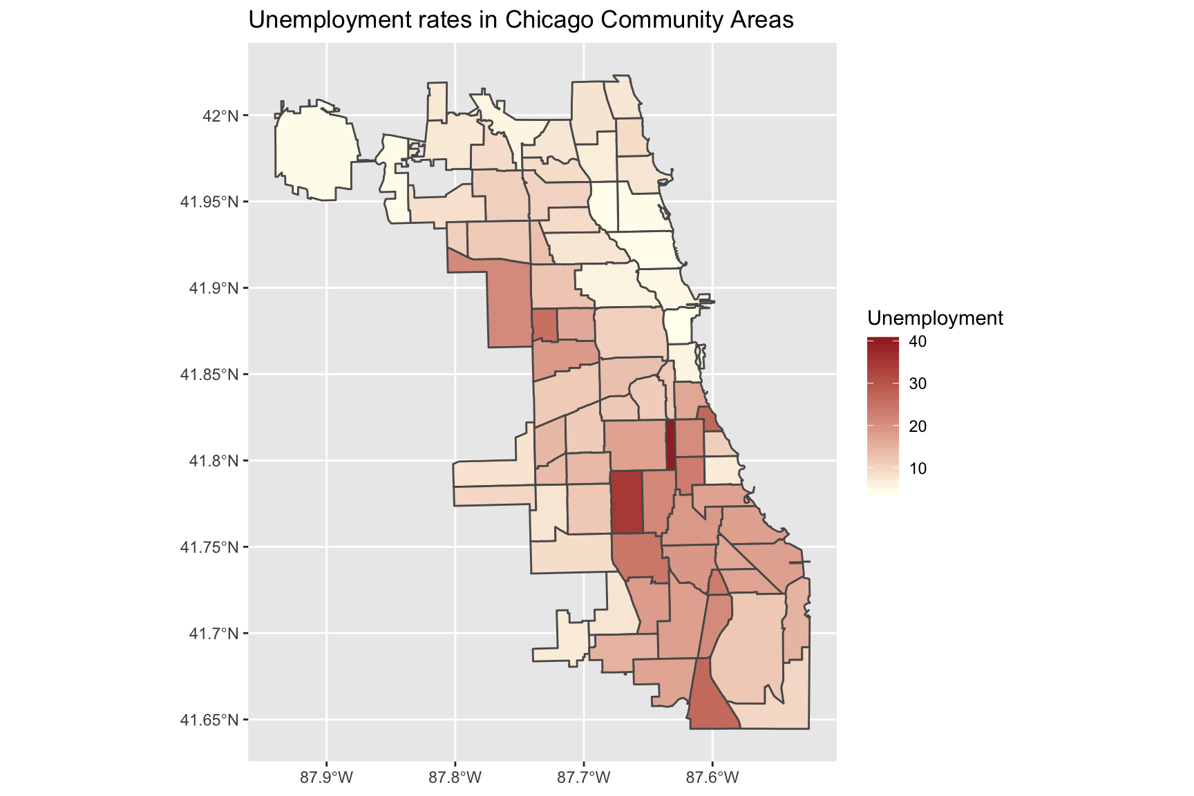
Using a divergent scale
You may want to use a divergent scale instead:
To get a divergent - but still continuous scale - you can use ggplot2::scale_fill_gradient2. To use this scale, set colours for the low, high and mid arguments. You may also have to set the midpoint argument ( which would otherwise be set to 0 by default).
ggplot(data = chi_health_map, aes(fill = Unemployment)) +
  geom_sf() +
  scale_fill_gradient2(low = "blue", mid = "white", high = "red", midpoint = 20) +
  ggtitle("Unemployment rates in Chicago Community Areas")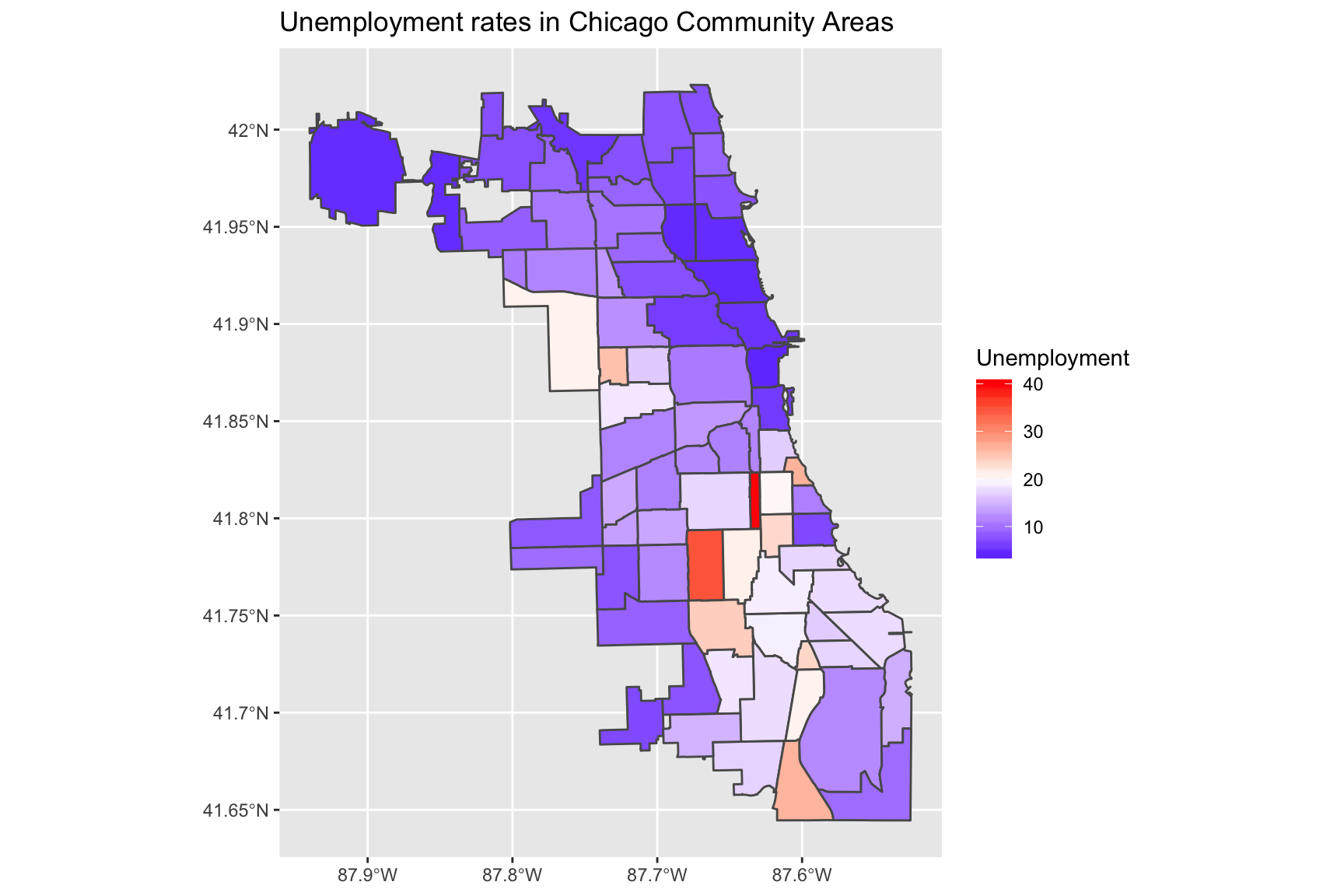
Using a discrete scale
Thus far, we have been using continuous scales to colour the regions of the chloropleth maps. This is a consequence of using a numeric variable as our fill aesthetic. Alternatively, we can use a discrete scale by assigning the fill to a categorical variable.
Creating a new categorical variable
First, create a new categorical variable for Unemployment - or any other variable in the data of your choosing. The code uses dplyr::case_when to divide the Unemployment variable into ranges:
chi_health_map <- chi_health_map %>%
  mutate(Unem_cat = case_when(
    Unemployment <= 10 ~ "0 - 10",
    10 < Unemployment & Unemployment <= 20 ~ "10+ - 20",
    20 < Unemployment & Unemployment <= 30 ~ "20+ - 30",
    30 < Unemployment  ~ "30+"))
Now, plot the new map:
ggplot(data = chi_health_map) +
  geom_sf(aes(fill = Unem_cat))  +
  labs(fill = "Unemployment (%)") +
  ggtitle("Unemployment rates in Chicago Community Areas")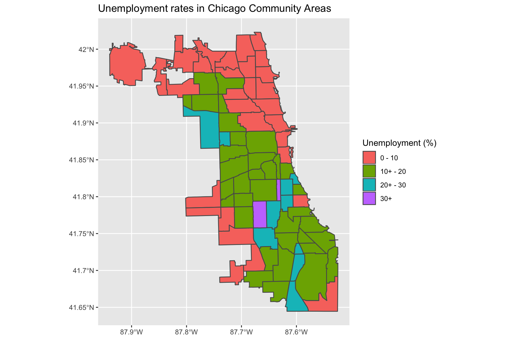
Plotting points on the map
To give an example of plotting points on a map, we can use Chicago Restaurant Inspection Data for February 2020. First, read in the data:
inspections <- read_csv("https://raw.githubusercontent.com/thisisdaryn/data/master/geo/chicago/Food_Inspections.csv")This data frame contains the following variables: Inspection ID,DBA Name,AKA Name,License #,Facility Type,Risk,Address,City,State,Zip,Inspection Date,Inspection Type,Results,Violations,Latitude,Longitude, and Location.
Now, we can place each restaurant inspected in the time period on the map by mapping the x and y aesthetics to the Longitude and Latitude variables in the dataframe. (Additionally, the code below maps the colour aesthetic to the Results variable.)
ggplot() +
  geom_sf(data = chi_map, fill = "ivory", colour = "ivory") +
  geom_point(data = inspections, aes(x = Longitude, y = Latitude, colour = Results)) +
  scale_color_viridis_d()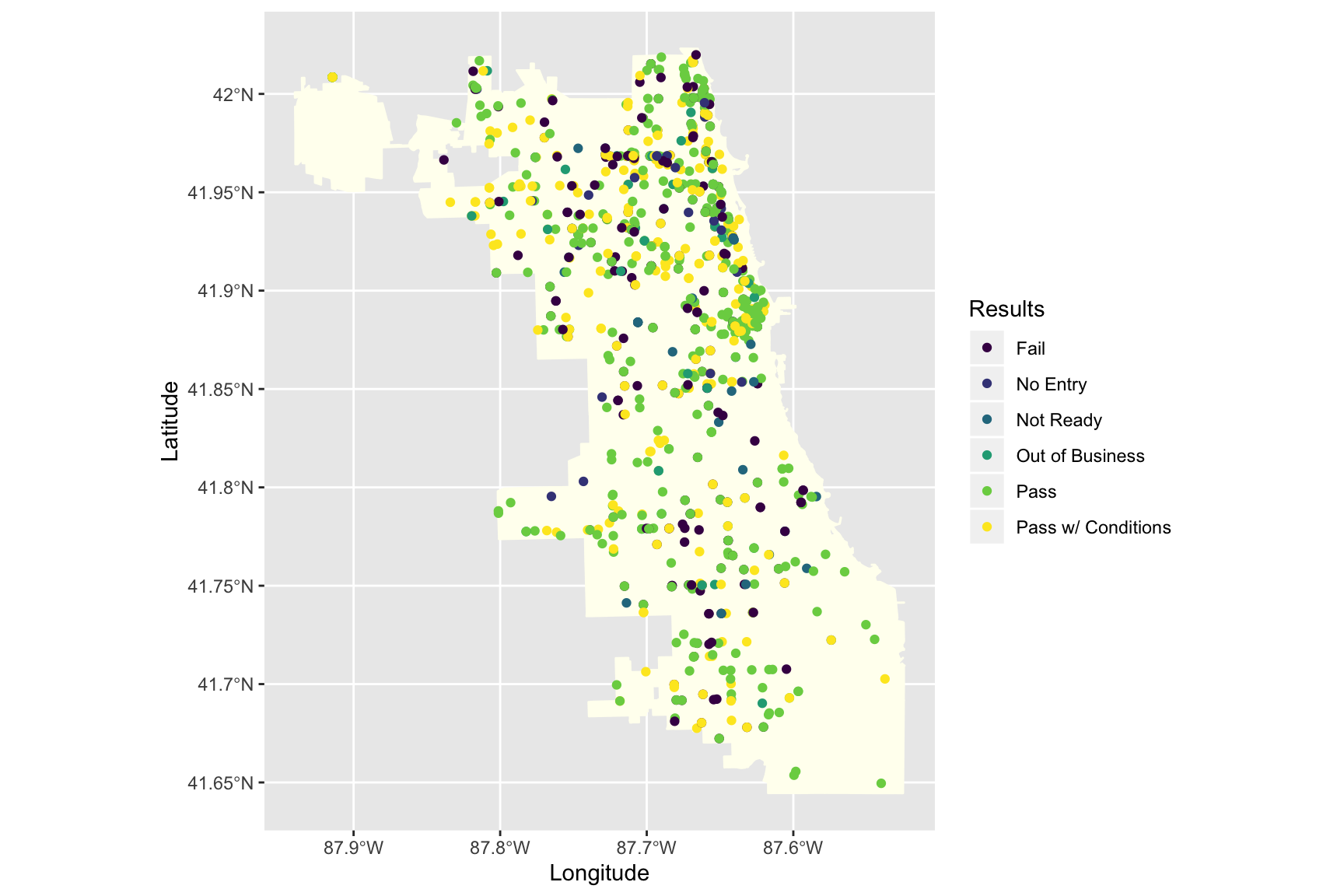
Interactive maps with plotly
Making interactive maps with plotly can also be relatively simple. In the code below we carry out the following steps:
- Create a new variable, desc containing the Restaurant Name, the inspection date and the result of the inspection using the corresponding variables in the data.
- Make a map with a uniform background colour with points for each restaurant inspection
- Create an interactive chart using plotly::ggplotly using the desc variable created above as the tooltip
library(plotly)
inspections <- inspections %>% mutate(desc = paste(`AKA Name`, `Inspection Date`, Results, sep = "\n"))

insp_plt <- ggplot() +
  geom_sf(data = chi_map, fill = "ivory", colour = "ivory") +
  geom_point(data = inspections,
             aes(x = Longitude, y = Latitude, colour = Results, text = desc)) +
  scale_color_viridis_d()

ggplotly(insp_plt, tooltip = "desc")
I hope that has been a useful introduction to making maps in R using ggplot2 and sf.