A few weeks ago, I got around to participating in TidyTuesday for the first time. The data set for that week (2019-12-03) contained data related to parking violations in the city of Philadelphia during 2017.
The plots I made and the code for each are below.
Plots
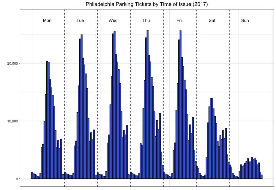
Histogram of ticket issue times
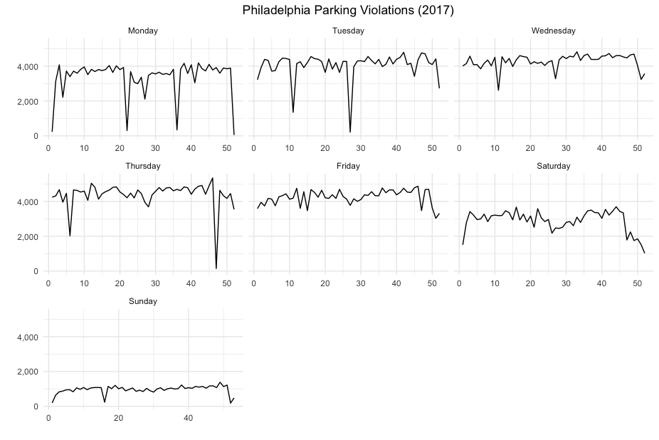
Totals per day by Day of the week
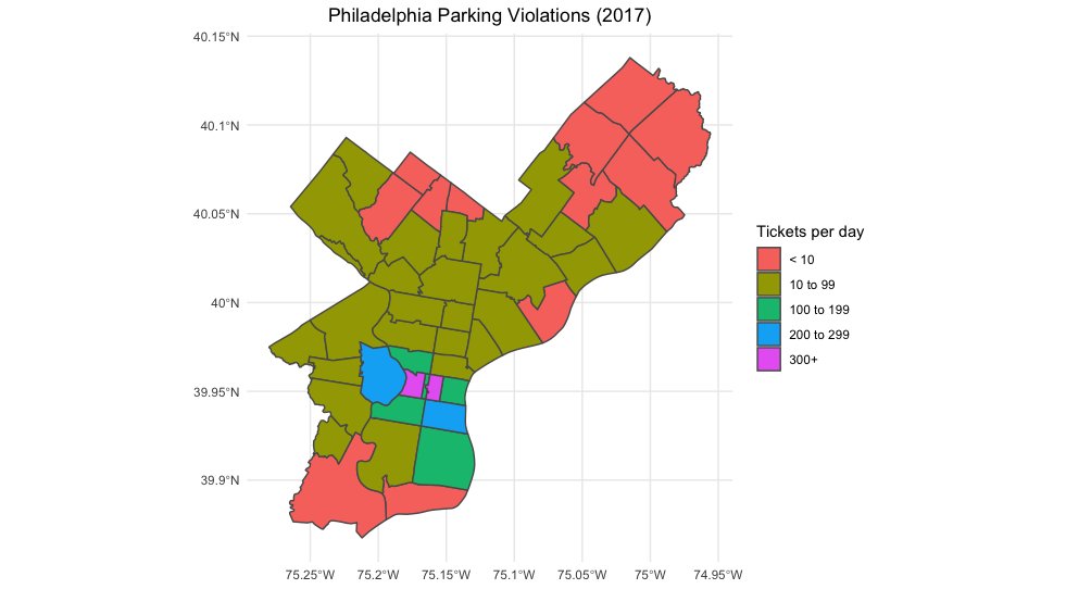
Map showing total tickets per day by zip code
I just realized that I did not share the code for any of the plots that I made so I will write it up here.
Reading data and data manipulation
First, I:
read in the data using read_csv {readr}
use head {utils} to look at the first few rows of the data
library(readr)

df <- read_csv("https://raw.githubusercontent.com/rfordatascience/tidytuesday/master/data/2019/2019-12-03/tickets.csv")
head(df)
## # A tibble: 6 x 7
## violation_desc issue_datetime fine issuing_agency lat lon zip_code
## <chr> <dttm> <dbl> <chr> <dbl> <dbl> <dbl>
## 1 BUS ONLY ZONE 2017-12-06 12:29:00 51 PPA 40.0 -75.1 19149
## 2 STOPPING PROHIB… 2017-10-16 18:03:00 51 PPA 40.0 -75.2 19127
## 3 OVER TIME LIMIT 2017-11-02 22:09:00 26 PPA 40.0 -75.2 19127
## 4 OVER TIME LIMIT 2017-11-05 20:19:00 26 PPA 40.0 -75.2 19127
## 5 STOP PROHIBITED… 2017-10-17 06:58:00 76 PPA 40.0 -75.2 19102
## 6 DOUBLE PARKED 2017-10-02 10:40:00 51 POLICE 40.0 -75.1 NANext, I make the following changes to the data:
separate the issue_datetime column into Date and Time columns using separate {tidyr}
use mutate {dplyr} to:
- Make the Date column a Date object using ymd {lubridate}
- create a new column, day, indicating the day of the week (e.g. Monday, Tuesday…) each ticket was issued
library(dplyr)
library(tidyr)
library(lubridate)

df <- separate(df, issue_datetime, into = c("Date", "Time"), sep = " ") %>%
  arrange(Date, Time) %>% ungroup %>% mutate(Date = ymd(Date),
                                             day = weekdays(Date))
The first 6 rows of df now contain the following information:
| violation_desc | Date | Time | fine | issuing_agency | lat | lon | zip_code | day |
|---|---|---|---|---|---|---|---|---|
| HP RESERVED SPACE | 2017-01-01 | 00:00:00 | 301 | POLICE | 39.99941 | -75.14233 | 19133 | Sunday |
| CORNER CLEARANCE | 2017-01-01 | 00:00:00 | 51 | POLICE | 39.95505 | -75.23199 | 19143 | Sunday |
| FIRE HYDRANT | 2017-01-01 | 00:00:00 | 76 | POLICE | 39.97776 | -75.24400 | 19151 | Sunday |
| BLOCKING DRIVEWAY | 2017-01-01 | 00:28:00 | 51 | POLICE | 39.97362 | -75.16394 | 19121 | Sunday |
| FIRE HYDRANT | 2017-01-01 | 00:41:00 | 76 | POLICE | 40.03015 | -75.08998 | 19124 | Sunday |
| DOUBLE PARKED CC | 2017-01-01 | 00:50:00 | 76 | POLICE | 39.94893 | -75.16093 | NA | Sunday |
Plot 1: Histogram of ticket issue times (hour)
Adding new variables
For this plot, I create new variables to:
- determine an offset corresponding to the day of the week
- determine the hour of day (from 0-23) each ticket was issued
- take the sum of the two values above so each of the 168 hours of the week is differentiated
Calculating an offset for each day
I created a data frame with the offset for each day:
day <- c("Monday", "Tuesday", "Wednesday", "Thursday",
  "Friday", "Saturday", "Sunday")
offset <- (0:6)*24

daylookup <- data.frame(day, offset)
daylookup
## day offset
## 1 Monday 0
## 2 Tuesday 24
## 3 Wednesday 48
## 4 Thursday 72
## 5 Friday 96
## 6 Saturday 120
## 7 Sunday 144Assigning each ticket an incident hour from 0 to 167
To assign each ticket to one of the 168 hours of the week, I carried out the following steps:
- create a new variable hr by splitting the existing variable Time
- convert hr into a numeric variable
- join the main data set to the table of offsets, daylookup
- create a new variable, incident_hr, of values 0-167 corresponding to the hour of the week.
df_hms <- separate(df, Time, into = c("hr", "minute", "second")) %>%
  mutate(hr = as.numeric(hr)) %>% left_join(daylookup) %>%
  mutate(incident_hr = offset+hr)
Making the plot
Now, I can make the plot using ggplot {ggplot2} using a histogram geometry.
library(ggplot2)
library(scales)

ggplot(data  = df_hms, aes(x = incident_hr)) +
  geom_histogram(fill = "royalblue", colour = "black", bins = 168) +
  theme(plot.title = element_text(hjust = 0.5)) +
  scale_y_continuous(label = comma) + xlab("") + ylab("") + theme_bw() +
  ggtitle("Philadelphia Parking Tickets by Time of Issue (2017)") +
theme(plot.title = element_text(hjust = 0.5)) 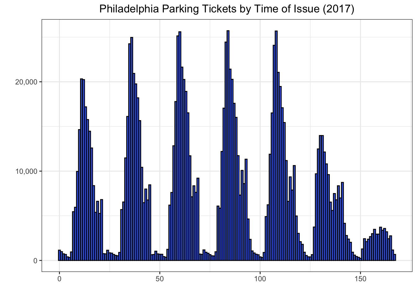
Annotating the plot
Then I annotated the plot by adding:
- vertical lines to separate the days of the week using geom_vline {ggplot2}
- text to insert the day names using annotate {ggplot2}
ggplot(data  = df_hms, aes(x = incident_hr)) +
  geom_histogram(fill = "royalblue", colour = "black", bins = 168) +
  theme(plot.title = element_text(hjust = 0.5)) +
  scale_y_continuous(label = comma) + xlab("") + ylab("") + theme_bw() +
  ggtitle("Philadelphia Parking Tickets by Time of Issue (2017)") +
  theme(plot.title = element_text(hjust = 0.5)) +
  geom_vline(xintercept = 23.5, linetype = "dashed") +
  geom_vline(xintercept = 47.5, linetype = "dashed") +
  geom_vline(xintercept = 71.5, linetype = "dashed") +
  geom_vline(xintercept = 95.5, linetype = "dashed") +
  geom_vline(xintercept = 119.5, linetype = "dashed") +
  geom_vline(xintercept = 143.5, linetype = "dashed") +
  annotate("text", x = 12, y = 27000, label = "Mon") +
  annotate("text", x = 36, y = 27000, label = "Tue") +
  annotate("text", x = 60, y = 27000, label = "Wed") +
  annotate("text", x = 84, y = 27000, label = "Thu") +
  annotate("text", x = 110, y = 27000, label = "Fri") +
  annotate("text", x = 134, y = 27000, label = "Sat") +
  annotate("text", x = 158, y = 27000, label = "Sun")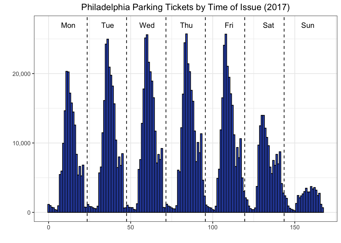
Plot 2: Day of week details
As background work to create this plot, I:
- create a 0-1 variable newday to flag all the rows of the data where the date is not the same as the date of the row above it. This identifies the start of the records for each day because the data has already been sorted by datetime.
- calculate the day of the year, daynum for each row by taking the cumulative sums of the newday column
- determine the week of the year by taking the remainder when daynum is divided by 7 (and adding 1 so the weeks start at 1 and not 0).
df$newday <- ifelse(df$Date == lag(df$Date), 0, 1)
df$newday <- ifelse(is.na(df$newday), 1, df$newday)

df$daynum <- cumsum(df$newday)
df$week <- ((df$daynum - 1) %/% 7) + 1
Finding total tickets per day
Next I did a few more data manipulation operations:
aggregating total tickets per day over the week and day variables
make day a factor with levels corresponding to the days of the week (Monday to Sunday)
agg_week <- group_by(df, week, day) %>% summarise(Tickets = n())
aw <- agg_week
aw$day <- factor(aw$day, levels = c("Monday", "Tuesday", "Wednesday", "Thursday",
                                    "Friday", "Saturday", "Sunday"))
Making a faceted line chart
Now to make a ggplot {ggplot2} with * with a line geometry * faceted on the week variable
library(ggplot2)
library(scales)

wkday_plt <- ggplot(data = aw, aes(x = week, y = Tickets)) + geom_line() +
  facet_wrap(~day, scales="free_x") + theme_minimal() +
  ggtitle("Philadelphia Parking Violations (2017)") +
  theme(plot.title = element_text(hjust = 0.5)) +
  scale_y_continuous(label = comma) + xlab("") + ylab("")

wkday_plt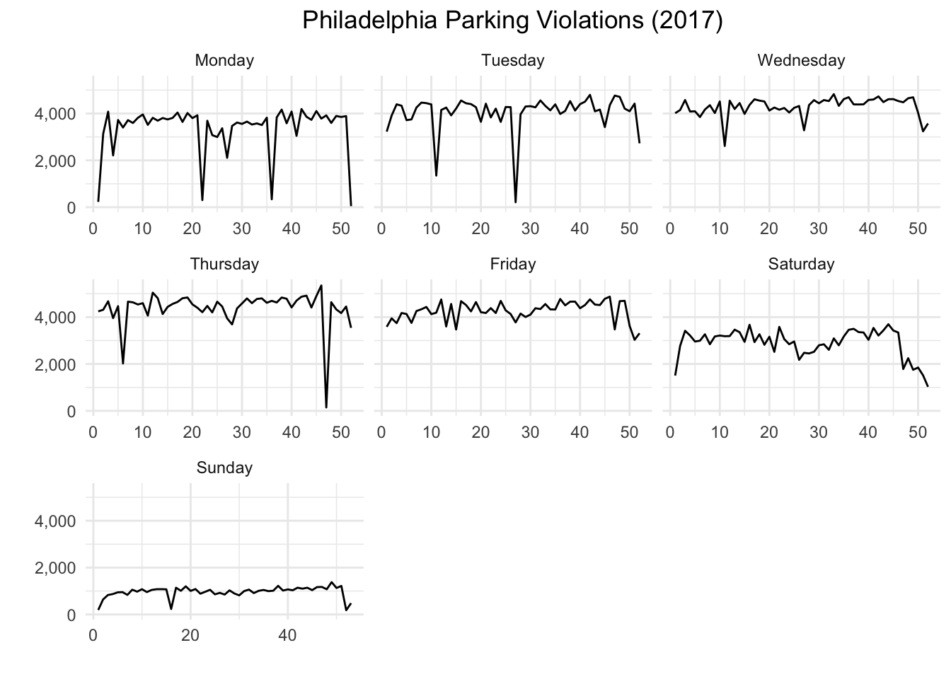
Alternative way to make a very similar chart
After making the chart, I realized that I could have made essentially the same chart simply by using Date as the x variable input. The only difference would be that the x-axis values would be dates instead of the week numbers. (I remove the dates on the x-axis anyway below.)
df_agg_day <- group_by(df, Date, day) %>% summarise(Tickets = n()) %>% ungroup()
df_agg_day$day <- factor(df_agg_day$day, levels = c("Monday", "Tuesday", "Wednesday", "Thursday",
                                    "Friday", "Saturday", "Sunday"))

wkday_plt2 <- ggplot(data = df_agg_day, aes(x = Date, y = Tickets)) + geom_line() +
  facet_wrap(~day) + theme_minimal() +
  ggtitle("Philadelphia Parking Violations (2017)") +
  theme(plot.title = element_text(hjust = 0.5),
        axis.text.x = element_blank()) +
  scale_y_continuous(label = comma) + xlab("") + ylab("")

wkday_plt2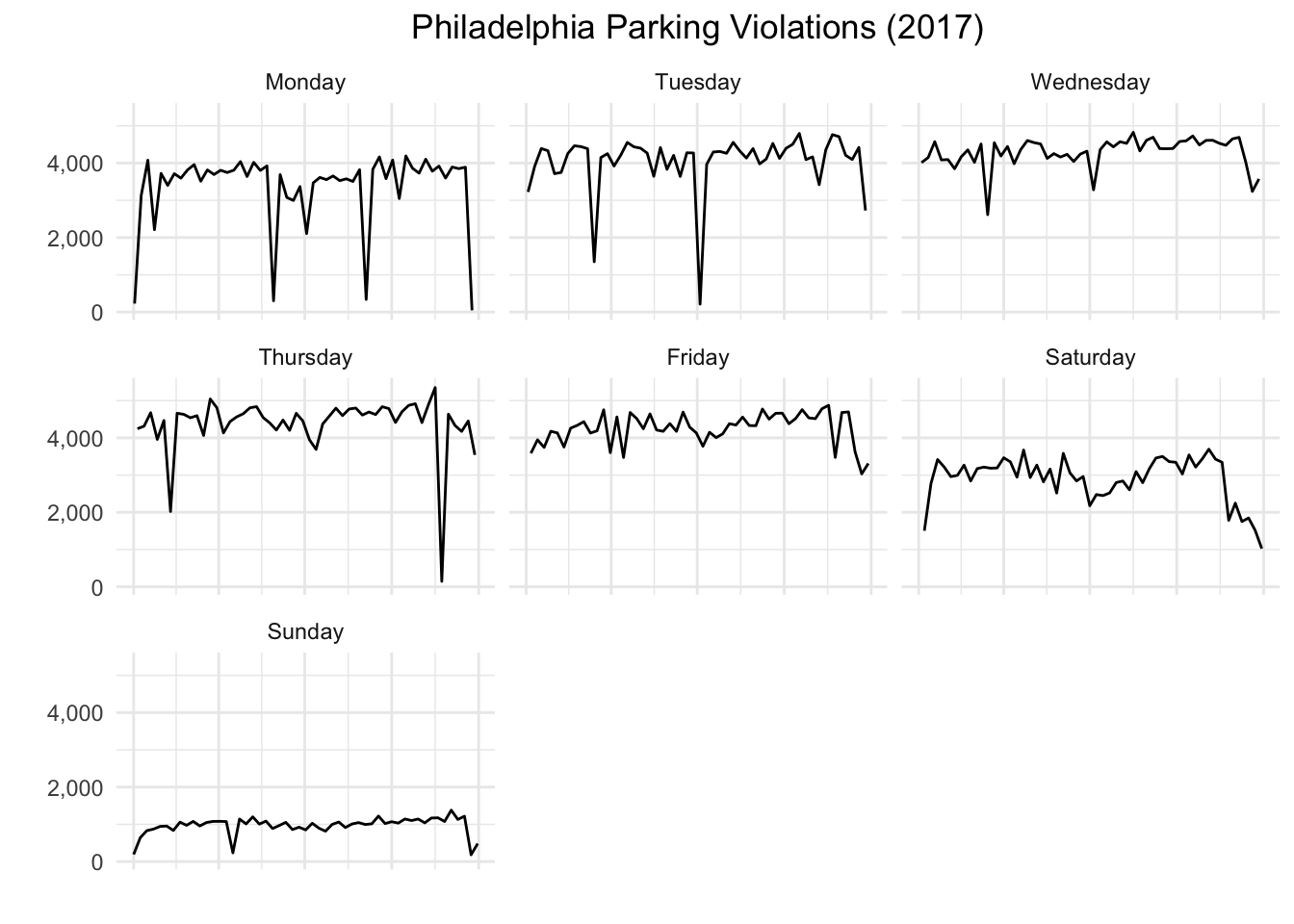
Making an interactive chart for the web with plotly
In the time since I originally made this plot, I have been using the plotly library. I think this is a good opportunity to demonstrate how easily it allows you to make an interactive chart for the web.
It’s really very simple:
create a ggplot
use the plot created as input to ggplotly
library(plotly)
ggplotly(wkday_plt2)
You can now hover over the chart and see the total tickets issued on a specific day and see the exact date. It’s a lot of functionality for very little effort.
Plot 3: Mapping parking violations by zip code
The key steps for making this plot are:
finding the average number of tickets per day in each zip code
putting the zip codes into groups
merging the numerical data to geospatial data corresponding to the shapes of the different zip codes represented in the data
Calculating tickets per day and grouping zip codes
use group_by {dplyr} and summarise {dplyr} to find the average number of tickets per day. (And don’t forget to ungroup with ungroup {dply} when you are done.)
add a new variable, Tickets per day to bucket the zip codes into 5 ranges
df_zip <- group_by(df, zip_code) %>%
  summarise(Tickets = n()/365) %>%
  ungroup() %>%
  mutate(`Tickets per day` = ifelse(Tickets < 10, "< 10",
                                    ifelse(Tickets < 100, "10 to 99",
                                           ifelse(Tickets < 200, "100 to 199",
                                                  ifelse(Tickets < 300, "200 to 299", "300+")))))
I really should learn how to avoid so many nested ifelse statements. I’m sure R – or a widely-used package – has a case statement.
Reading in shapefile (.shp)
I was able to get a shapefile for the zip codes of Philadelphia from OpenDataPhilly.
To read it in, I used the readOGR {rgdal} function which reads the shapefile into a Spatial vector object.
library(rgdal) # will load sp package as well
philly <- readOGR("Zipcodes_Poly/Zipcodes_Poly.shp")
Looking at the created object, philly in the Viewer window we can see that the CODE field (contained in data) contains the 48 zip codes corresponding to the 48 polygons in polygons.

Merging shapefile with ticket frequency data
Next we can merge the data frame, df_zip (containing the average tickets per day for each zip code) with the Spatial object, philly (containing the specification of the polygons for the zip codes).
We can do this using merge {sp}. I load the sf package as I will be using another function from it immediately after.
library(sf)
philly <- merge(philly, df_zip, by.x = "CODE",
                        by.y = "zip_code")
Converting to an sf object
Now we convert philly to an sf (Simple Features) object which will work very easily with ggplot {ggplot2}.
phi_sf <- st_as_sf(philly)Making the plot
Actually making the plot with ggplot is very simple: just use the geom_sf {ggplot2} to use a simple features geometry and indicate that Tickets per day is the variable we want to use as the fill color for each zip code.
library(ggplot2)
ggplot() + geom_sf(data = phi_sf, aes(fill = `Tickets per day` )) + theme_minimal() +
  ggtitle("Philadelphia Parking Violations (2017)") +
  theme(plot.title = element_text(hjust = 0.5))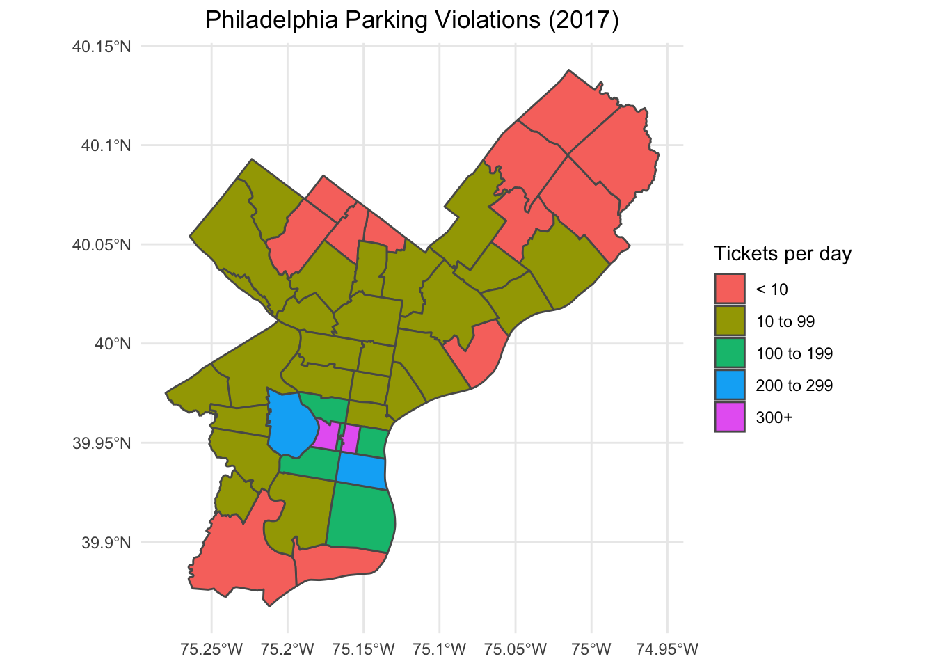
Strictly speaking, these per day averages may be incorrect as approximately 14% of the tickets in the raw data have no corresponding zip code. So these averages are really lower bounds for 2017.
So that’s it. The plots I made for TidyTuesday on 2019-12-03. Until next time.