Earlier this week, I had made a calendar visualization of some data that I had come across participating in TidyTuesday in December.
The data set was the set of tickets issued for parking violations in the city of Philadelphia, Pennsylvania in 2017. Originally, I had made a few other visualizations and a friend of mine had mentioned that they would be interested in seeing visualizations of the revenues generated by the city due to these parking tickets.
I had the idea to use ggplot2::geom_tile to make the calendar to show the revenue for each day of the year and it came out just as I envisioned.
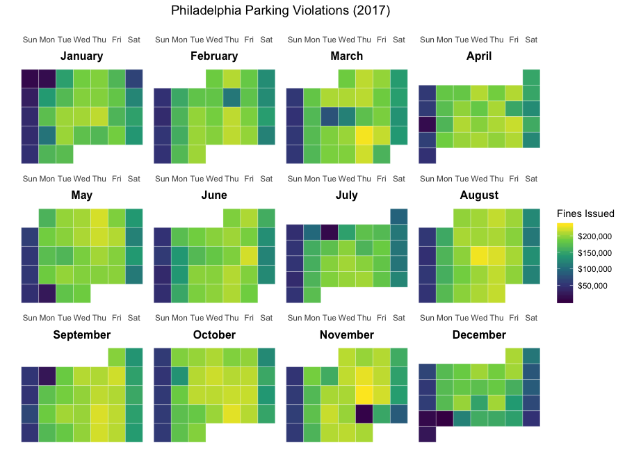
Calendar depicting total daily fines for parking violations in Philadelphia in 2017
Here is a walkthrough of the code.
Reading in data
library(tidyverse)

philly <- read_csv("https://raw.githubusercontent.com/rfordatascience/tidytuesday/master/data/2019/2019-12-03/tickets.csv")
Getting total tickets and fines ($) per day
First get the total number of tickets and the sum of all fines issued for each day:
library(lubridate)

daily_totals <- philly %>%
  mutate(issue_date = as_date(issue_datetime)) %>%
  group_by(issue_date) %>%
  summarise(Tickets = n(),
            Fines = sum(fine, na.rm = TRUE)) %>%
  ungroup()
Determining the location of each day’s value in the calendar
The coordinates to determine in plotting the values in the calendar are:
The day of the week determines which column the value is within the month
The week of the month determines which row the value is within the month
The month will determine which facet the value lies in
We can use R’s built-in, weekdays function to get the day of the week.
To determine the row of the calendar that each day falls on, notice that:
the 1st of the month is on the first row
each Sunday starts a new row
The code below creates a variable week_increment that is set to 1 for each day that is either the 1st of the month or a Sunday.
daily_totals <- philly %>%
  mutate(issue_date = as_date(issue_datetime)) %>%
  group_by(issue_date) %>%
  summarise(Tickets = n(),
            Fines = sum(fine, na.rm = TRUE)) %>%
  ungroup() %>%
  mutate(wday = weekdays(issue_date),
         month_day = day(issue_date),
         month = month(issue_date),
         week_increment = ifelse(month_day == 1 | wday == "Sun", 1, 0))
Next we calculate the week (row) for each individual date by taking these steps:
group by month. (This will make the count of weeks start over for each month)
take the running sum of the week_increment to get the new variable week which will represent the row of the monthly calendar the day should be displayed on
Additionally, create a new column, text_month with the month name e.g. January, February etc
daily_totals <- philly %>%
  mutate(issue_date = as_date(issue_datetime)) %>%
  group_by(issue_date) %>%
  summarise(Tickets = n(),
            Fines = sum(fine, na.rm = TRUE)) %>%
  ungroup() %>%
  mutate(wday = str_sub(weekdays(issue_date), 1, 3),
         month_day = day(issue_date),
         month = month(issue_date),
         week_increment = ifelse(month_day == 1 | wday == "Sun", 1, 0)) %>%
  group_by(month) %>%
  mutate(week = cumsum(week_increment),
         text_month = months(issue_date)) %>%
  ungroup()
Setting factor levels for month and weekday
If factor levels are not set for text_month and wday the variables representing the calendar month and day of the week respectively, ggplot2 wil order them in alphabetical order by default.
To set the factor orders, use:
wday_vec <- c("Sun", "Mon", "Tue", "Wed", "Thu", "Fri", "Sat")
daily_totals$wday <- factor(daily_totals$wday, levels = wday_vec)
month_vec <- c("January", "February", "March", "April", "May", "June",
               "July", "August", "September", "October", "November", "December")
daily_totals$text_month <- factor(daily_totals$text_month,
                            levels =  month_vec)
Creating the plot
Now, everything is in place to use ggplot2::geom_tile. The code below uses the viridis scale to set the values of the fill aesthetic which is mapped to the Fines variable.
library(scales) # to get the dollar values formatted

philly_calendar <- ggplot(daily_totals, aes(x = wday, y = week)) +
  geom_tile(aes(fill = Fines), colour = "white") +
  facet_wrap(~text_month, scales = "free") +
  scale_y_reverse() +
  theme_minimal() +
  scale_fill_viridis_c(labels = dollar) +
  scale_x_discrete(position = "top")
philly_calendar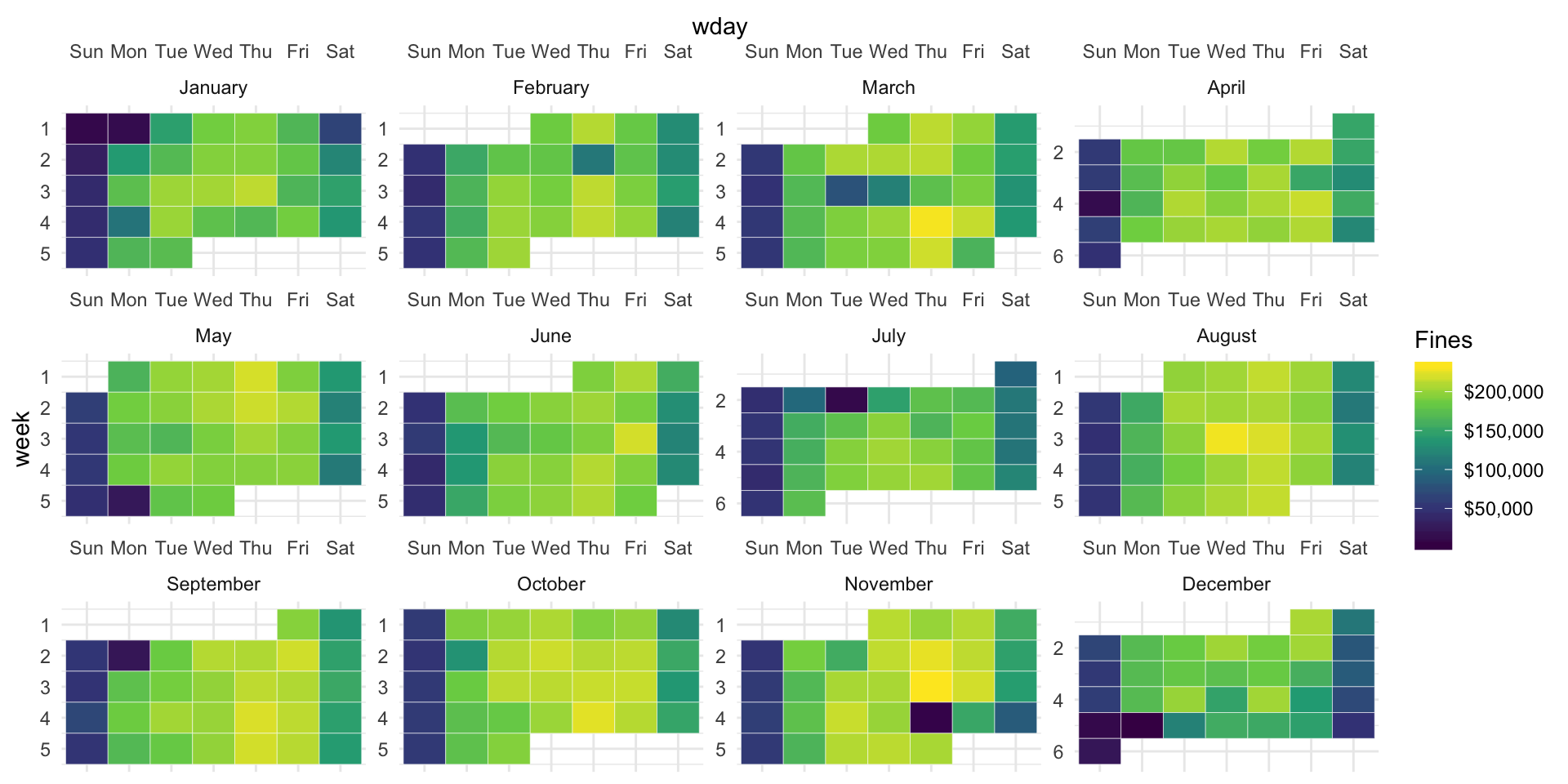
Modifying the theme
Some modifications for the theme are added to:
Remove the axis labels
Center the plot title
Make the facet labels (month names) bold
remove grid-lines
philly_calendar <- ggplot(daily_totals, aes(x = wday, y = week)) +
  geom_tile(aes(fill = Fines), colour = "white") +
  facet_wrap(~text_month, scales = "free") +
  scale_y_reverse() +
  theme_minimal() +
  scale_fill_viridis_c(labels = dollar) +
  scale_x_discrete(position = "top") +
  ylab("") + xlab("") + labs(fill = "Fines Issued") +
  ggtitle("Philadelphia Parking Violations (2017)") +
  theme(panel.grid.major = element_blank(),
        panel.grid.minor = element_blank(),
        axis.text.y = element_blank(),
        strip.text.x = element_text(
          size = 12, color = "black", face = "bold"),
        plot.title = element_text(size = 14, hjust = 0.5))

philly_calendar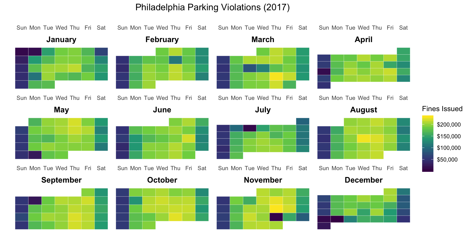
Creating an interactive chart with plotly
I really appreciate the ease with which the plotly package makes interactive charts from ggplot2::ggplot objects. They typically work very well right out of the box without too much customisation.
Creating a new field for a tooltip
First create a new column to hold the tooltip text. I wanted the tooltip to read over two lines, for example:
Sunday Jan 1, 2017
$11,151
This code creates a new column, fine_txt with the tooltip text in the desired format:
daily_totals <- daily_totals %>% mutate(fine_txt = paste0("$",formatC(Fines, format="f", big.mark=",", digits = 0)),
                        desc = paste(wday, text_month, month_day, 2017, "\n", fine_txt))
Now,
map the text aesthetic to the newly created variable, fine_txt
pass the column name to plotly::ggplotly as the tooltip argument.
library(plotly)


philly_calendar <- ggplot(daily_totals, aes(x = wday, y = week, text = desc)) +
  geom_tile(aes(fill = Fines), colour = "white") +
  facet_wrap(~text_month, scales = "free") +
  scale_y_reverse() +
  theme_minimal() +
  scale_fill_viridis_c(labels = dollar) +
  scale_x_discrete(position = "top") +
  ylab("") + xlab("") + labs(fill = "Fines Issued") +
  ggtitle("Philadelphia Parking Violations (2017)") +
  theme(panel.grid.major = element_blank(),
        panel.grid.minor = element_blank(),
        axis.text.y = element_blank(),
        strip.text.x = element_text(
          size = 12, color = "black", face = "bold"),
        plot.title = element_text(size = 14, hjust = 0.5))

ggplotly(philly_calendar, tooltip = "desc")
Voilà!